# Template
## **1. Install & Select Theme**
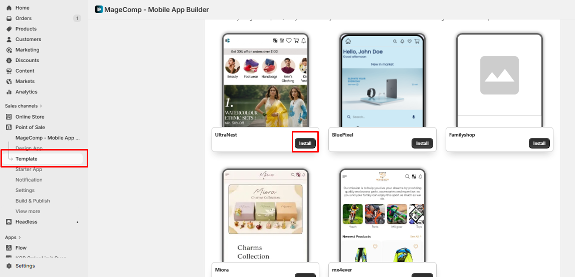
#### 1. Install Templates
Install a template to enable app integration and ensure proper functionality.
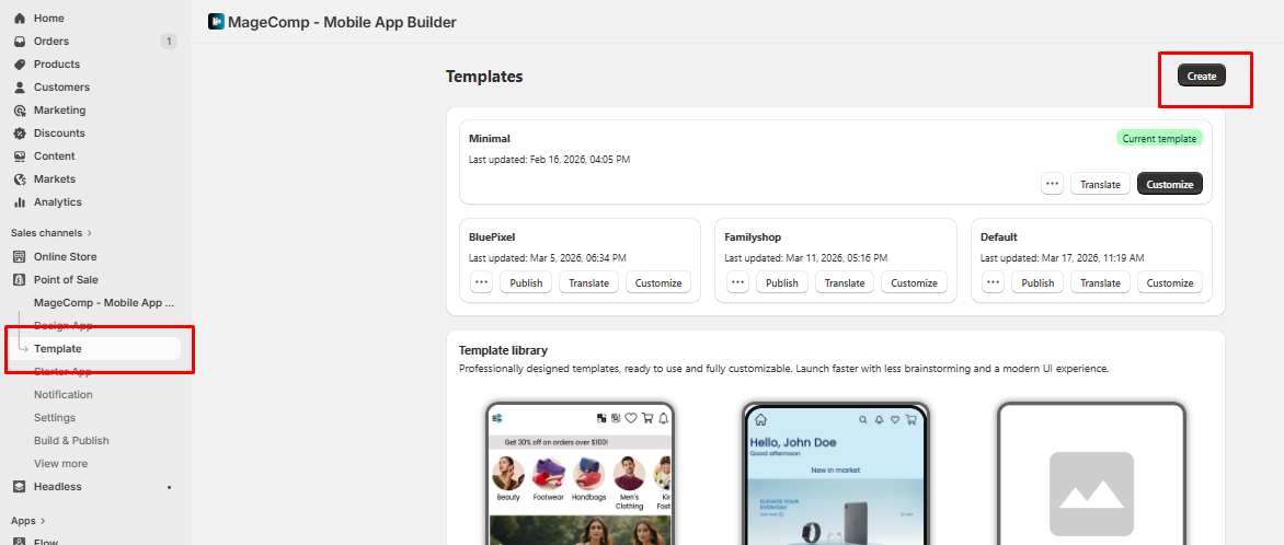
#### 2. Create Your Own Template
Click **Create** (top right) to build a new template and assign it a custom name.
#### 3. Customize Your Design
Click **Customize** to adjust colors, fonts, banners, and layout as per your brand.
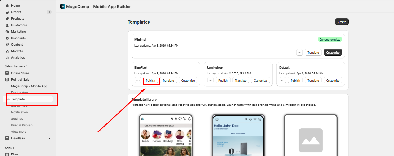
#### 4. Publish & Go Live
Click **Publish** to make the template live. Changes reflect instantly in your app.
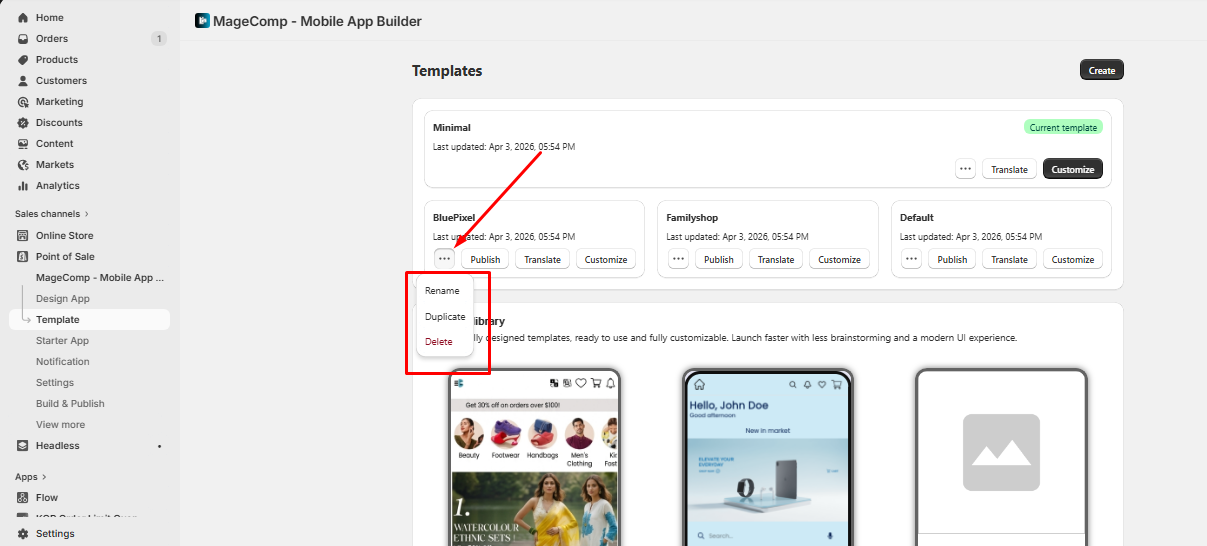
#### 5. Manage Your Templates
Use the **••• menu** to Rename, Duplicate, or Delete templates. Duplicate to test variations easily.
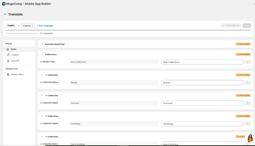
#### 6. Multi-Language Support for Templates
Easily create and manage content in multiple languages to support a global audience.
{% hint style="info" %}
**Tip:** You can have multiple themes installed and switch between them anytime.
{% endhint %}
## **2. Home Page Customization Sections for default templates**
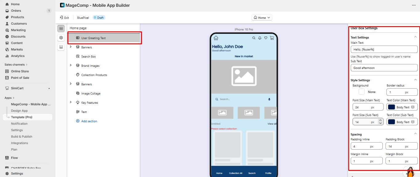
1. **User Greeting (User Box)**
* **Purpose:** Personalizes the app for logged-in users.
* **Settings:**
* **Main Text: Hello {%User%}** – shows the logged-in user’s name.
* **Sub Text:** e.g., Good Afternoon
* **Style Settings:** Background, border radius, font size, text colors, padding, and margins.
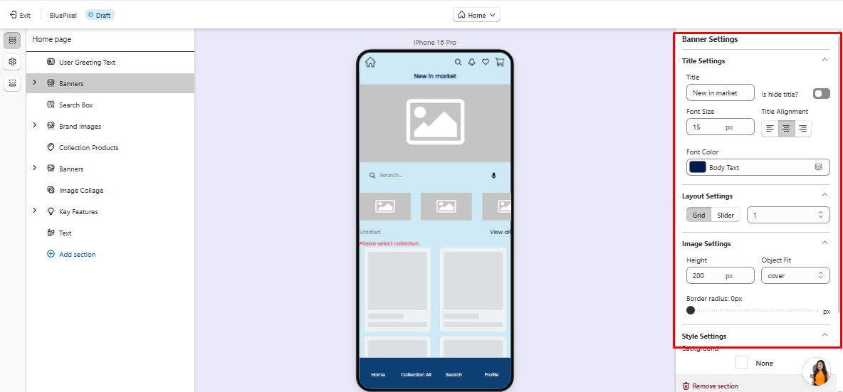
2. **Banners :**
* **Purpose:** Showcase products, promotions, or collections visually.
* **Settings:**
* Upload images and link actions (products, collections, pages).
* Layout: Slider or grid.
* Title: Customize font, color, alignment, and visibility.
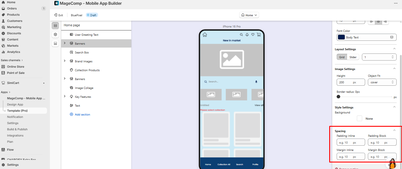
* Spacing: Adjust padding and margins for perfect placement.
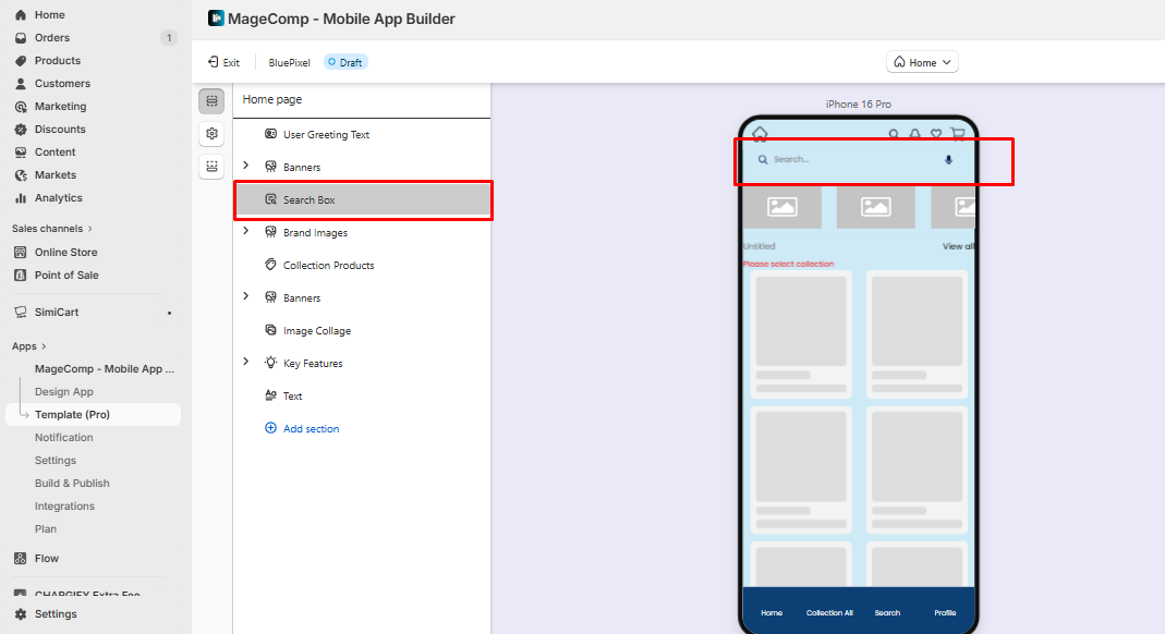
**Search Box**
* **Purpose:** Allows users to search for products and content easily.
* **Settings:** Background, font styles, padding, and placement.
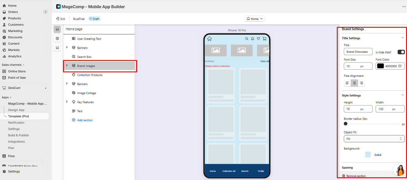
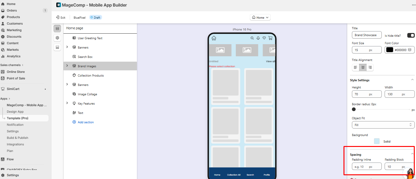
**Brand Showcase**
* **Purpose:** Highlight your brand logos or partners.
* **Settings:**
* Title: Font, color, alignment, hide/show.
* Image dimensions, object fit, border radius, and background.
* Padding and spacing adjustments.
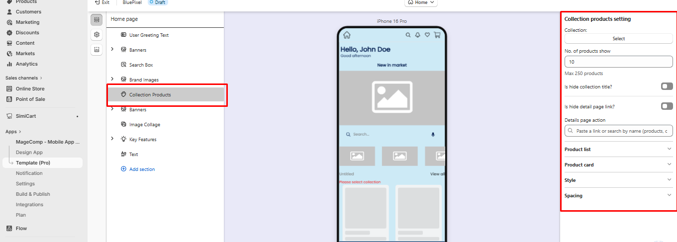
**Collection Products (Product List)**
* **Purpose:** Display products in an attractive grid or slider.
* **Settings:**
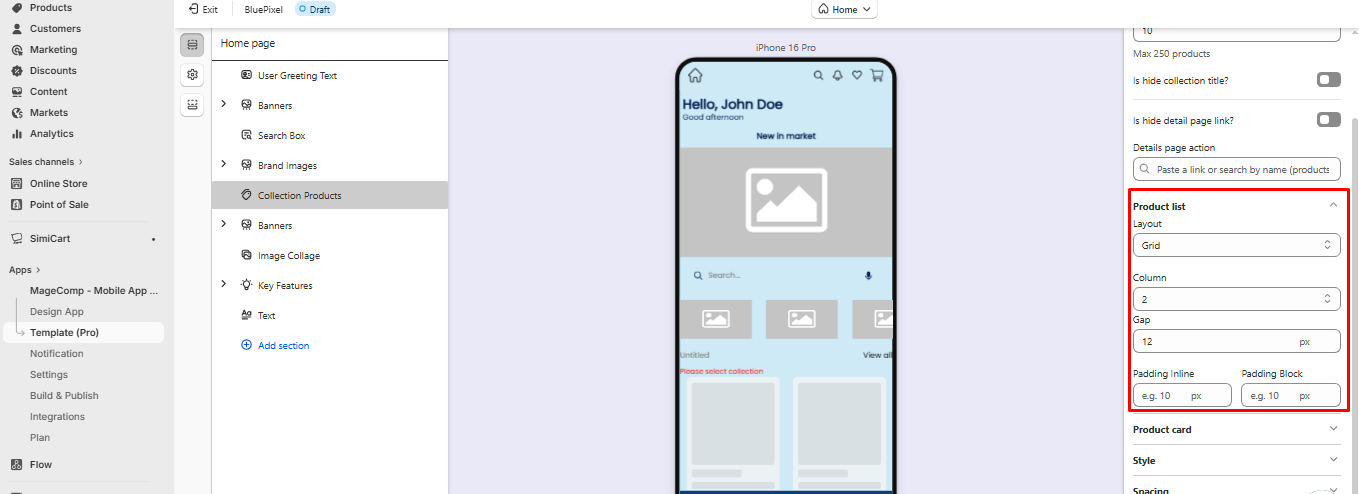
### 1. Product List
The **Product List** section lets you showcase collections of products in your app in a **grid or slider layout**, with full control over the product cards, styling, and spacing.
**1. Layout Setting**
* **Grid or Slider:** Choose how your products are displayed.
* **Grid Example:** 2 columns, 12px gap between items.
* **Slider Example:** Users can swipe through products horizontally.
* **Columns:** Number of columns for the grid. Example: `2` columns shows 2 products per row.
* **Gap:** Space between products. Example: `12px` gap keeps items visually separated.
* **Padding Inline / Block:** Space inside the product section.
* **Inline padding:** Space on left and right. Example: `10px`.
* **Block padding:** Space on top and bottom. Example: `10px`.
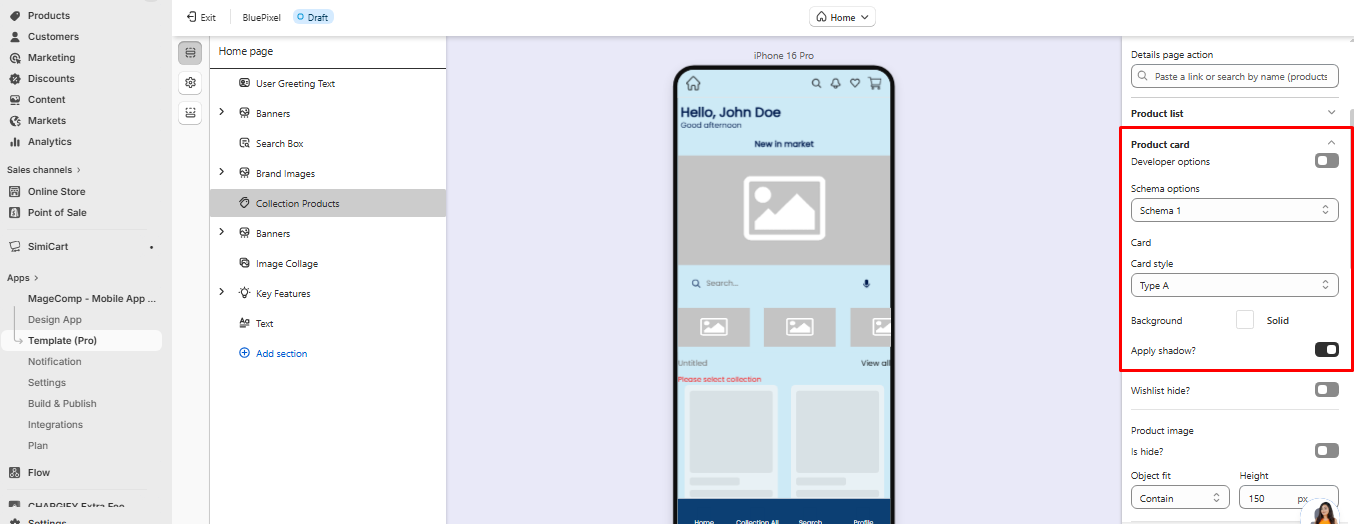
#### **2. Product Card Settings**
This controls how individual products are displayed inside the grid or slider.
**Developer Options / Schema Options**
* **Schema 1:** Predefined layout schema for product card structure.
* **Card Style (Type A, B…):** Determines the card design (e.g., Type A may have image on top, text below).
**Background & Shadow**
* **Background:** Set a background color for the product card.
* **Apply Shadow:** Enable shadow for a lifted card effect.
**Wishlist**
* **Hide/Show Wishlist:** Decide whether users can add products to their wishlist.
#### **1. Product Image**
* **Hide Image:** Toggle visibility of the product image.
* **Object Fit:** Determines how the image fits the card.
* **Contain:** Image fits fully without cropping.
* **Cover:** Image fills the card, may crop edges.
* **Height:** Set a fixed image height. Example: 150px.
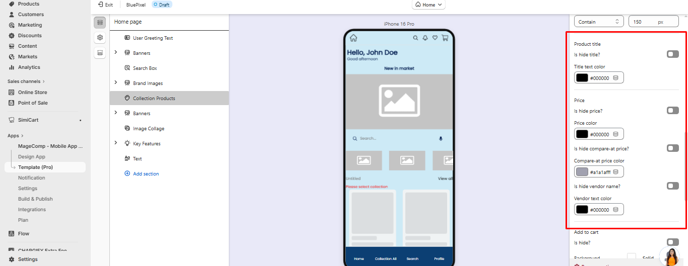
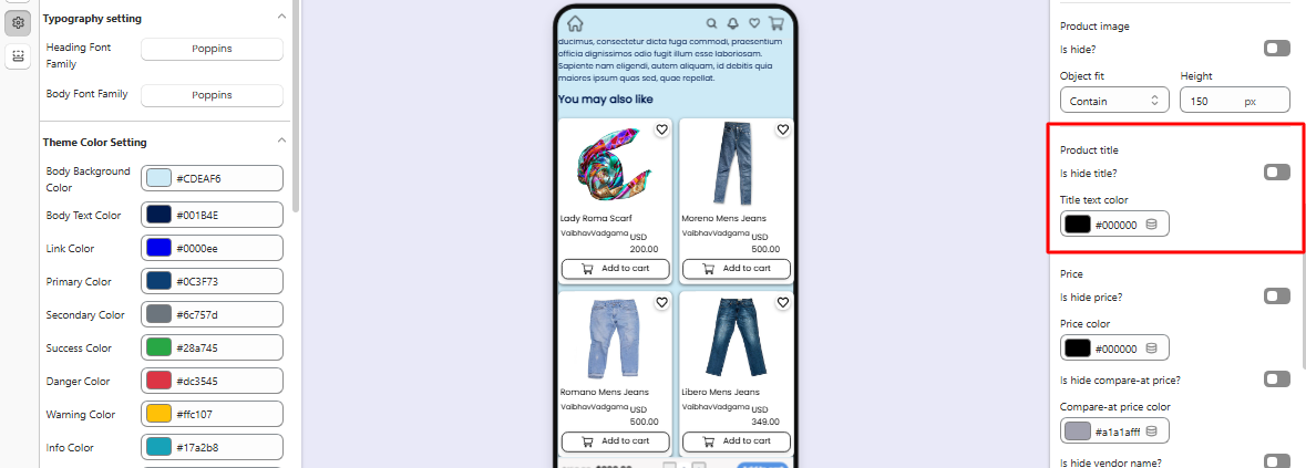
#### **2. Product Details**
* **Title:**
* Hide/Show option.
* Text color customization. Example: `#000000` (black).
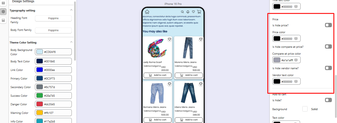
* **Price:**
* Hide/Show price.
* Price color customization. Example: `#000000`.
* **Compare-at Price:**
* Hide/Show original price for discounts.
* Color customization. Example: `#a1a1afff`.
* **Vendor Name:**
* Hide/Show the vendor or brand.
* Color customization. Example: `#000000`.
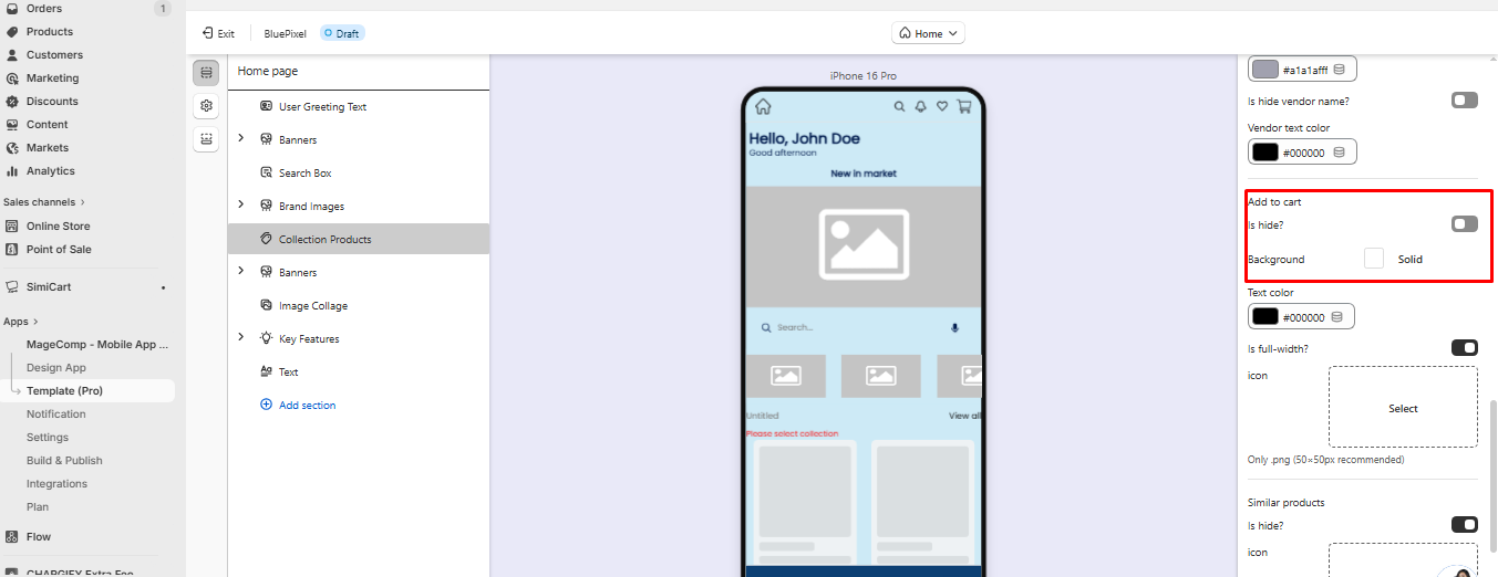
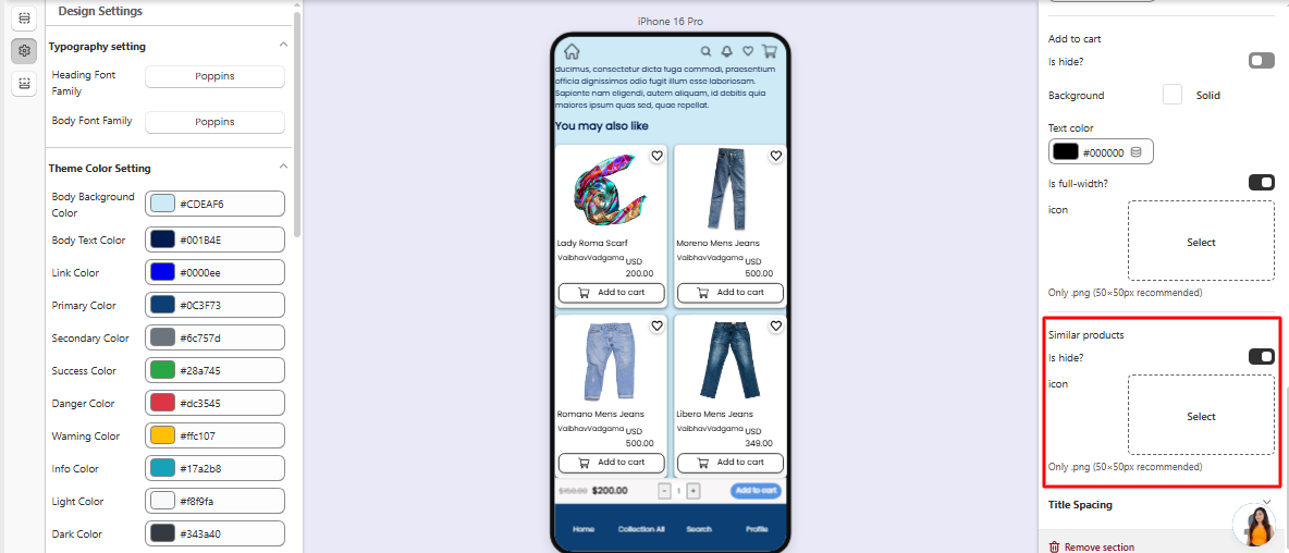
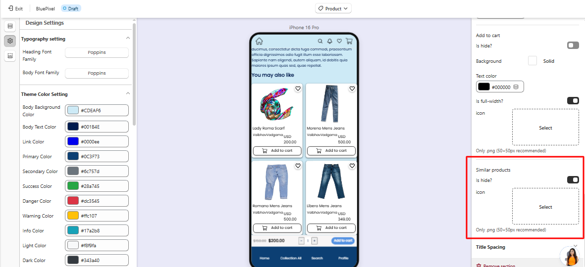
#### **3. Add to Cart Button**
* **Hide/Show:** Choose whether to display the Add to Cart button.
* **Background & Text Color:** Example: Black text (`#000000ff`) on a white background.
* **Full-width Option:** Make button span the entire card width.
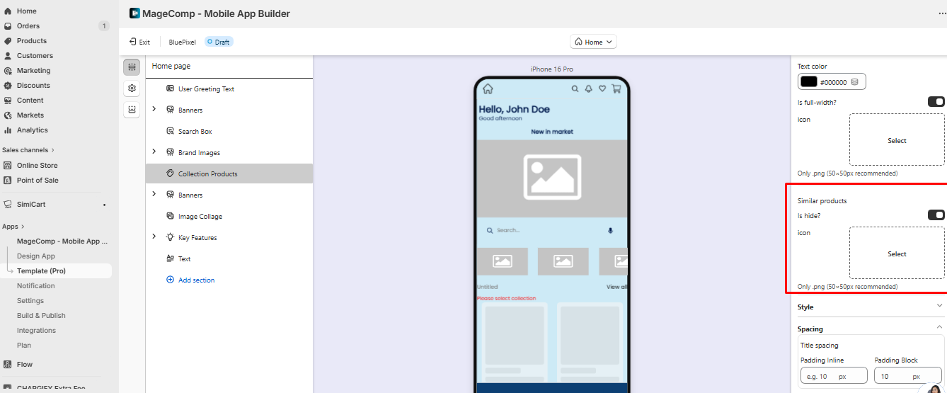
#### **4. Similar Products**
* **Hide/Show:** Decide whether to show similar products for cross-selling.
* **Icon Settings:** Only `.png` recommended, size 50×50px.
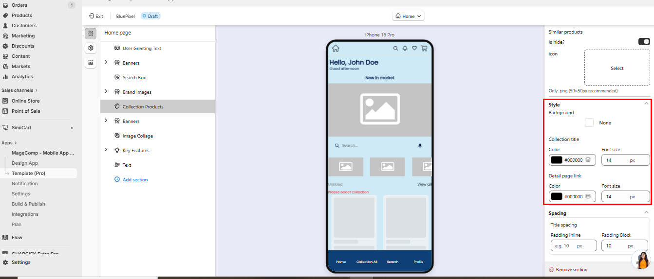
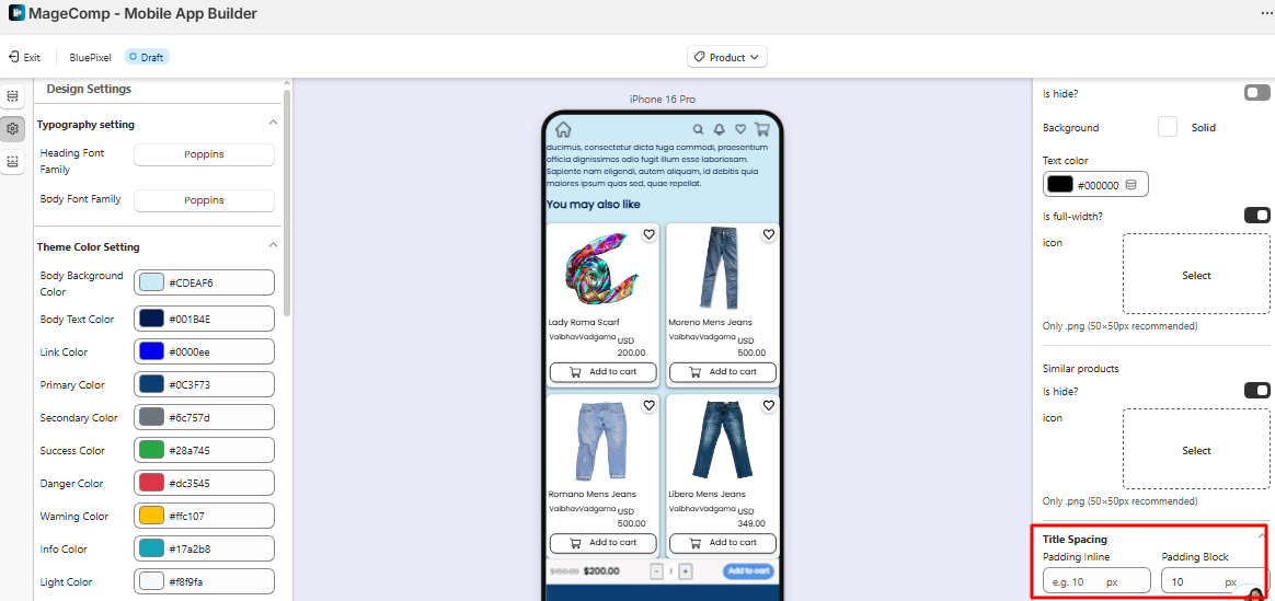
#### **5. Styling & Collection Title**
* **Background:** Customize section background.
* **Collection Title:**
* Color: Example `#000000` (black).
* Font Size: Example `14px`.
* **Detail Page Link:**
* Text color: Example `#000000`.
* Font size: Example `14px`.
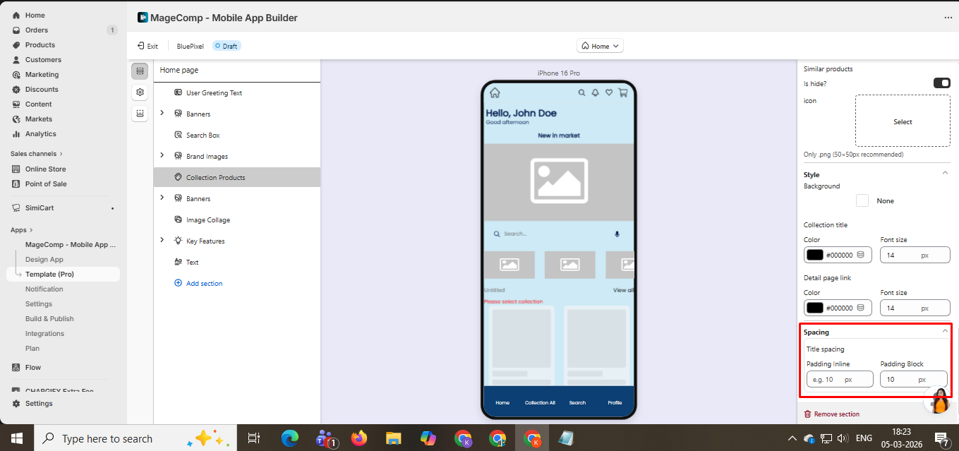
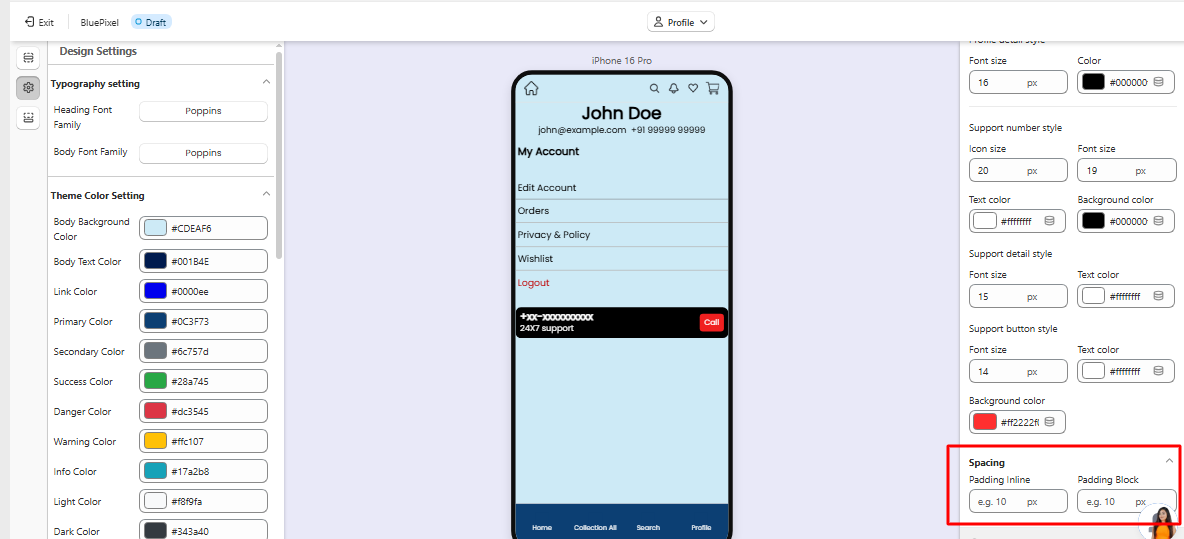
#### **6. Spacing**
* **Title Spacing:** Adjust padding and margins around the collection title.
* **Padding Inline:** Space left and right. Example: `10px`.
* **Padding Block:** Space top and bottom. Example: `10px`.
#### **Example Use Case**
Suppose you want to display your **“Summer Collection”** in a 2-column grid:
* **Grid:** 2 columns, 12px gap
* **Product Card:** Type A, shadow enabled, wishlist shown
* **Product Image:** Contain, height 150px
* **Title & Price:** Visible, black text
* **Add to Cart:** Visible, full-width button, black text
* **Collection Title:** Summer Collection, black, font 14px
* **Padding Inline/Block:** 10px each
This setup ensures your product section is **clean, visually balanced, and fully functional** for your app users.
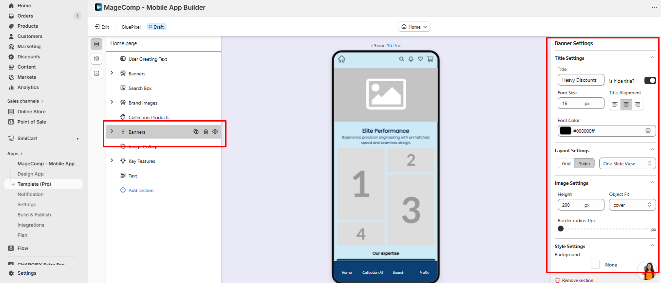
**1. Banner Slider / One Slide View**
* **Purpose:** Highlight promotions or featured products.
* **Settings:** Image height, object fit, border radius, spacing, padding, and margin.
* **Layout Options:** One slide view or multiple slides.
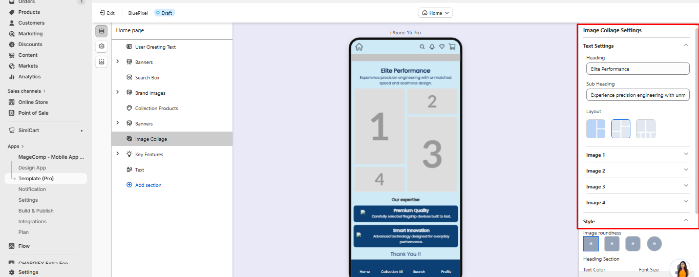
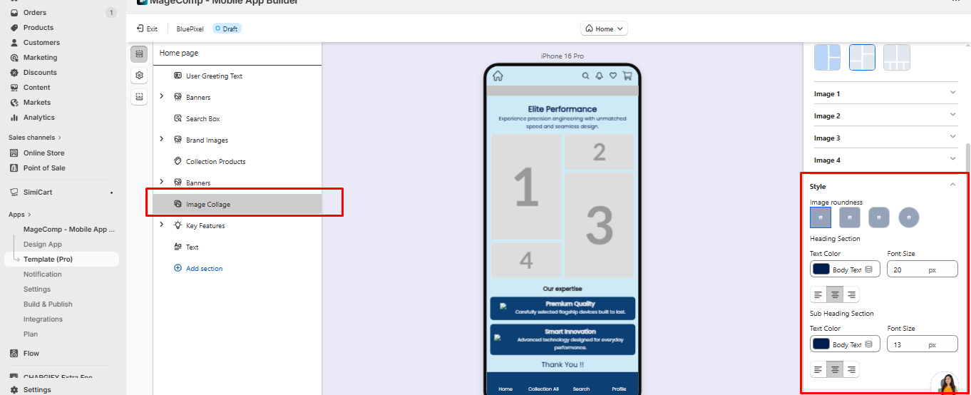
**2. Image Collage**
* **Purpose:** Display multiple images with heading and subheading.
* **Settings:**
* Heading & Subheading: Text, font size, color.
* Upload multiple images, set object fit, and link actions.
* Adjust image roundness and spacing.
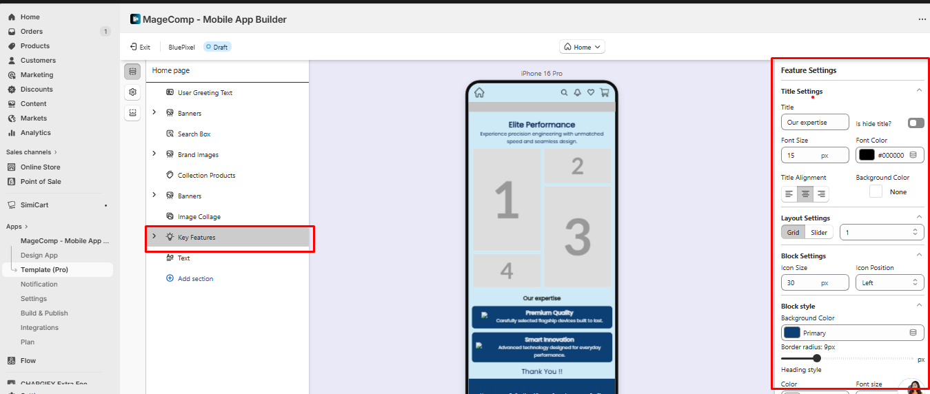
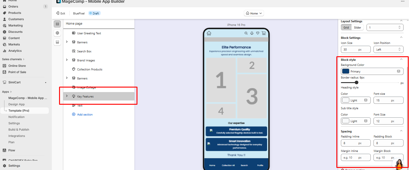
**3. Key Features Section**
* **Purpose:** Highlight your services or product benefits.
* **Settings:**
* Title: Font size, color, alignment.
* Blocks: Icon size, position, background color, border radius.
* Heading & subtitle: Font size, color, padding, margin.
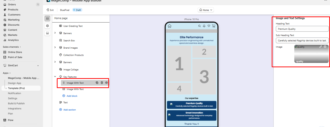
**Image with Text**
* **Purpose:** Showcase products with descriptions.
* **Settings:** Heading & Subheading, image object fit, spacing, padding, background.
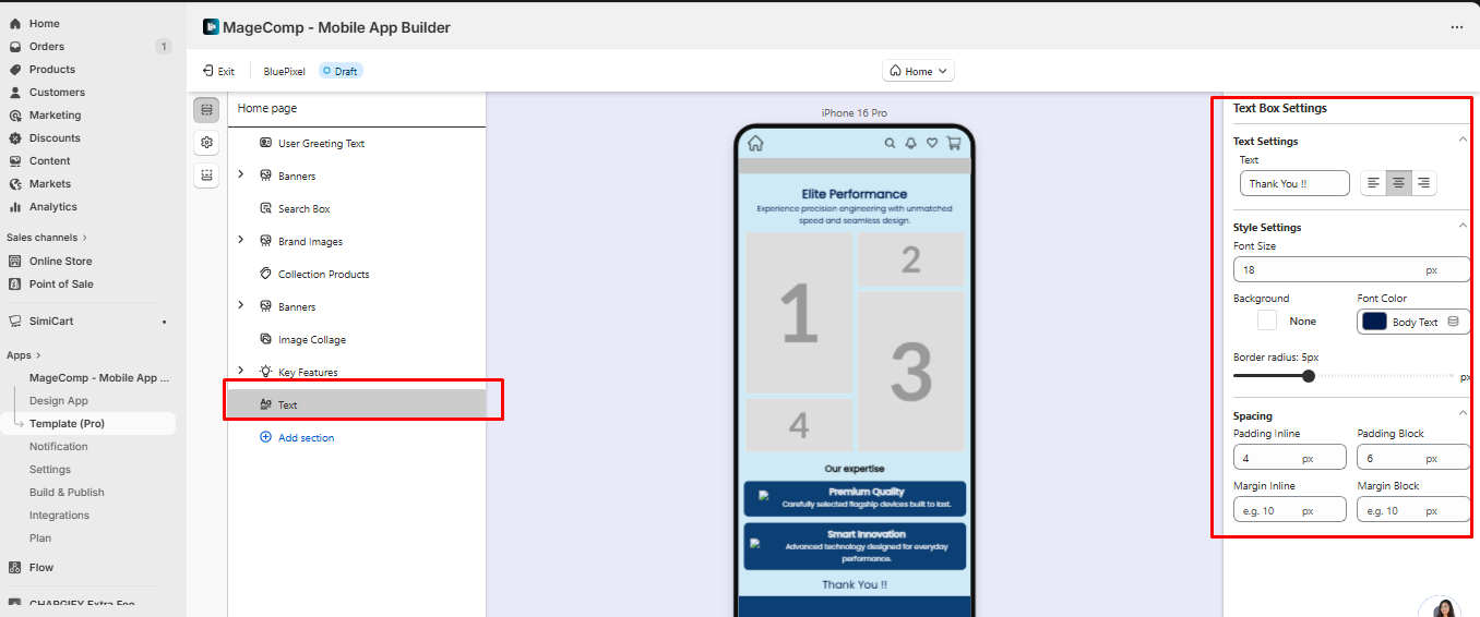
**4. Text Box**
* **Purpose:** Add standalone text messages or announcements.
* **Settings:** Text content, font size, color, background, border radius, padding, and margin.
## 3. Product Page Settings
The **Product Page Settings** allow you to control how products appear on the product detail page, including product images, wishlist behavior, product recommendations, and the product card layout. These settings help you customize the shopping experience while keeping the design aligned with your brand.
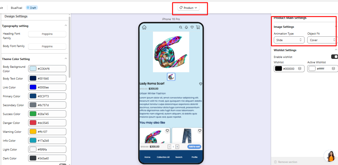
### Image Settings
These settings control how product images are displayed.
**Animation Type**\
Defines the transition effect when users swipe through product images.\
Example: *Slide*
**Object Fit**\
Controls how images adjust inside the image container.\
Example: *Cover* ensures the image fills the container without distortion.
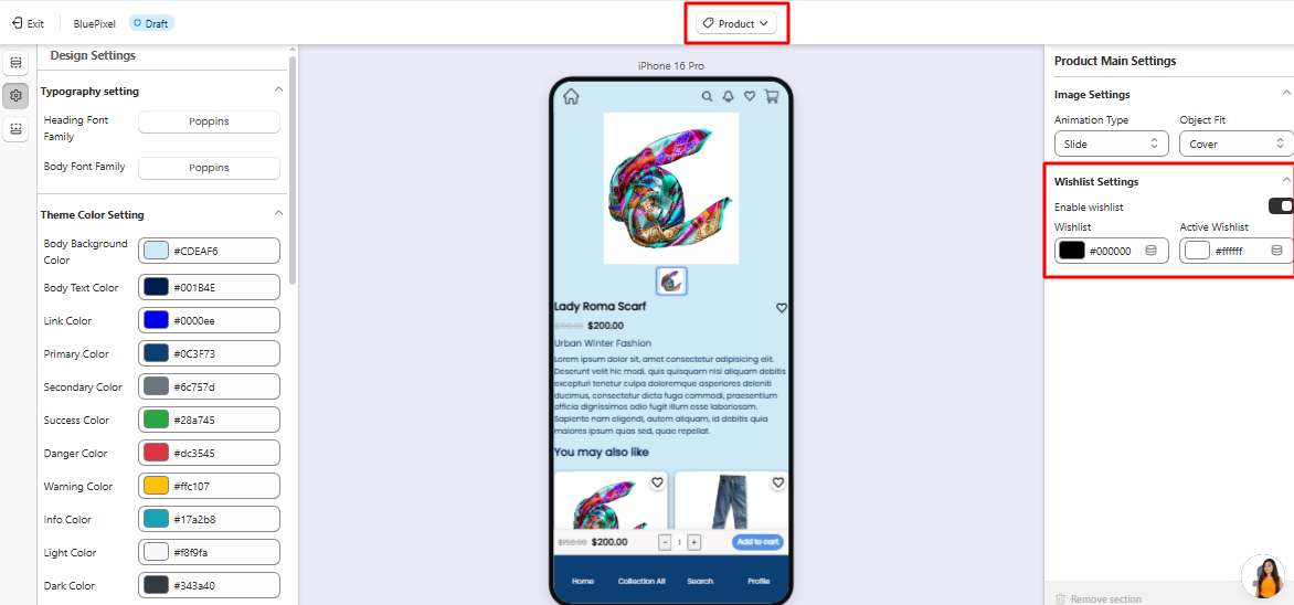
### Wishlist Settings
These options control the wishlist functionality on the product page.
**Enable Wishlist**\
Allows customers to add products to their wishlist.
**Wishlist Color**\
Defines the default icon color.
**Active Wishlist Color**\
Defines the icon color when a product is added to the wishlist.
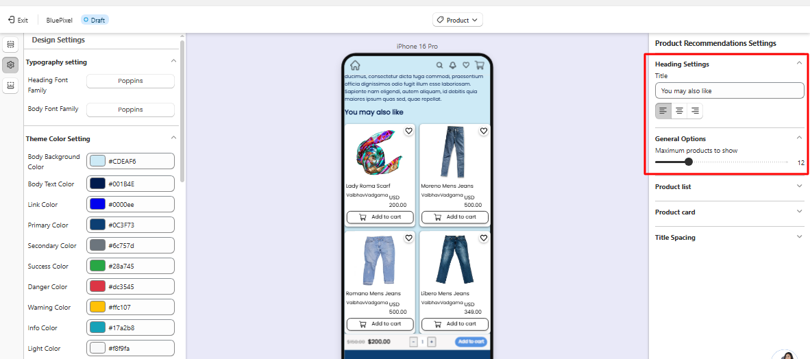
### Product Recommendations Settings
This section allows you to display recommended products on the product page.
#### Heading Settings
Defines the title shown above the recommended products section.\
Example: **“You may also like”**
#### General Options
**Maximum Products to Show**\
Controls how many recommended products appear.\
Example: 12
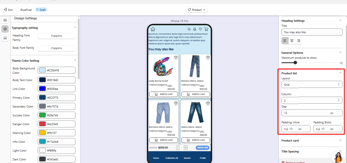
### Product List Layout
These settings control how recommended products are displayed.
**Layout**\
Defines the layout style. Example: *Grid*
**Columns**\
Number of products shown per row. Example: `2`
**Gap**\
Spacing between product cards.
**Padding Inline / Padding Block**\
Controls horizontal and vertical spacing around the product list.
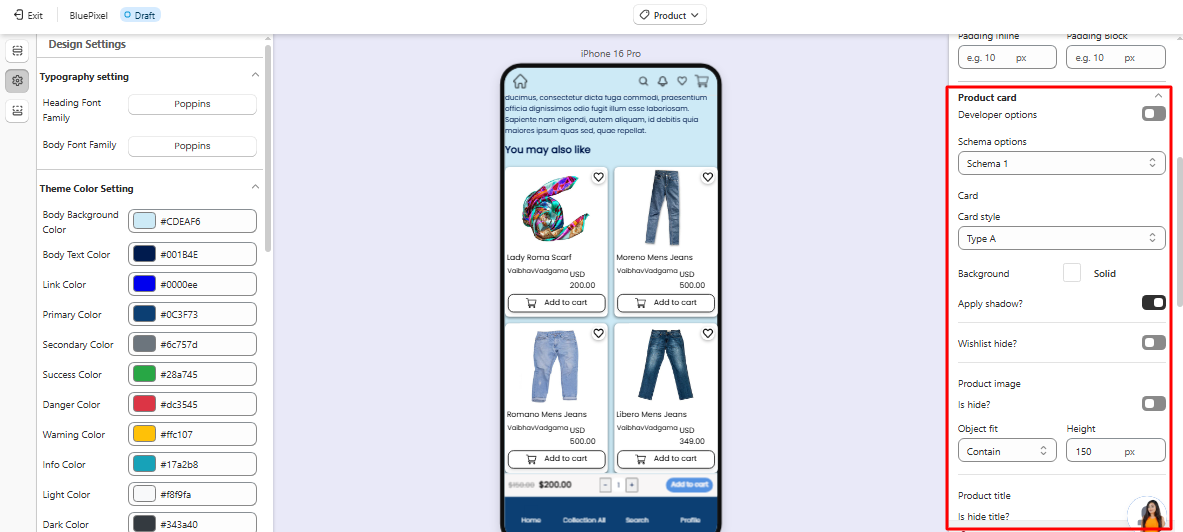
### **Product Card Settings**
These settings control the design and elements inside each product card.
**Card Style**: Choose the product card design style (e.g., Type A).
\
**Background**: Defines the background style of the product card.
\
**Shadow**: Enable or disable shadow around the product card.
\
**Wishlist Visibility**: Option to hide the wishlist icon from product cards.
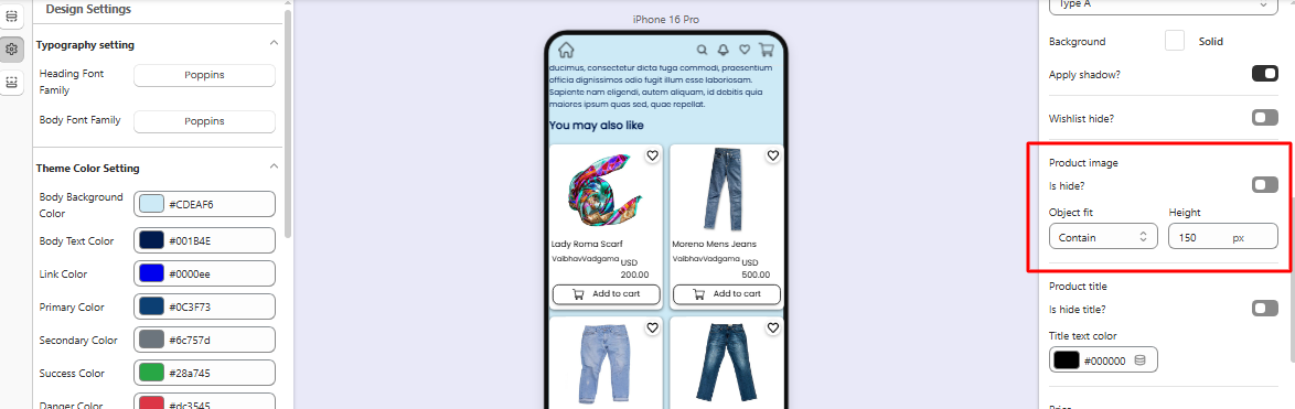
### Product Image
Controls how images appear inside product cards.
* Option to hide the product image
* **Object Fit** defines how images scale (e.g., *Contain*)
* **Height** controls image display height
### Product Information
Controls the visibility and colors of product details.
**Product Title**
* Option to hide the title
* Title text color customization
**Price**
* Option to hide the price
* Price color customization
**Compare-at Price**
* Option to hide the original price
* Custom color setting
**Vendor Name**
* Option to show or hide the vendor name
* Vendor text color customization
### Add to Cart Button
Controls the appearance and behavior of the **Add to Cart** button.
Options include:
* Hide/show the button
* Button background color
* Text color
* Full-width button option
* Custom icon support (.png recommended size **50×50px**)
### Similar Products Button
Allows displaying a **Similar Products** option on product cards.
Settings include:
* Show/hide option
* Custom icon support (.png **50×50px recommended**)
### Title Spacing
Controls spacing around product titles.
**Padding Inline** – horizontal spacing\
**Padding Block** – vertical spacing
Using these settings, you can fully control how products and recommendations appear on the product page, helping create a visually consistent and user-friendly shopping experience.
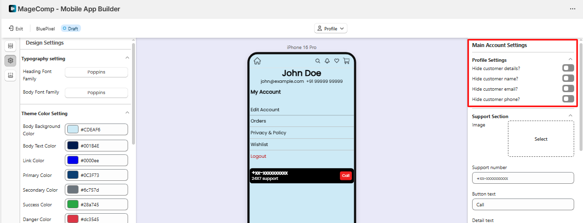
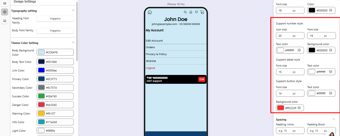
## 4. Profile Page Settings
The **Profile Page Settings** allow you to customize the layout, appearance, and visible elements of the customer profile section in the mobile app. This section helps merchants control how customers access their personal information, orders, addresses, and account-related options.
These settings ensure the profile page remains organized, easy to navigate, and aligned with your app’s design.
### Profile Header Settings
This section controls the appearance of the **top area of the profile page**.
**Profile Image**\
Displays the customer’s profile picture or default avatar.
**Customer Name**\
Shows the logged-in customer’s name.
**Email or Account Information**\
Displays the customer’s registered email or account details.
These elements help customers quickly identify their account information.
### Account Options
This section defines the **main menu items available inside the profile page**. Common options include:
* **My Orders** – Allows customers to view their order history and order details.
* **My Addresses** – Lets customers manage saved shipping and billing addresses.
* **Wishlist** – Displays products saved by the customer for later purchase.
* **Account Details** – Allows customers to update personal information.
* **Notifications** – Shows app notifications related to orders or promotions.
Merchants can control which options are visible to customers.
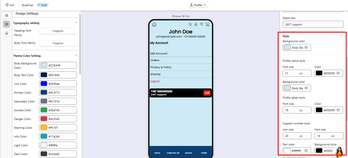
### Layout Settings
These settings control the **visual layout of the profile page menu items**.
**Layout Type**\
Defines how profile options appear (for example, list or grid layout).
**Spacing**\
Controls the space between menu items to maintain a clean and readable interface.
**Padding**\
Defines the spacing around profile sections for better visual structure.
### Icon Settings
Icons help users quickly recognize profile menu options.
* Merchants can assign **custom icons** to each profile option.
* Recommended icon format: **PNG**
* Recommended size: **50 × 50 px**
### Visibility Controls
Each profile section can be **shown or hidden** depending on your store's requirements.
For example:
* Hide the wishlist if the feature is disabled
* Hide addresses if not required
* Hide notifications if not used
This allows merchants to keep the profile page clean and focused.
Using the **Profile Page Settings**, you can customize how customers access and manage their account information within the mobile app, ensuring a simple and user-friendly account management experience.
## 5. Design Settings
The **Design Settings** section allows you to customize the visual appearance of your mobile app directly from the admin panel. Using these settings, you can control typography, theme colors, buttons, and input field styles to match your brand identity and create a consistent user experience across the entire app.
These settings help merchants design their app without needing any coding knowledge.
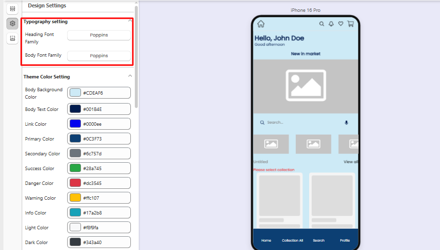
## Typography Settings
Typography settings allow you to control the fonts used throughout the mobile app.
#### Heading Font Family
This setting controls the font used for all **headings and titles** across the app, such as:
* Section titles
* Product titles
* Page headings
* Category names
Choose a font that represents your brand and ensures readability.
#### Body Font Family
This setting controls the font used for **general text content** in the app, including:
* Product descriptions
* Paragraph text
* Labels
* Informational text
For the best user experience, it is recommended to use a font that is easy to read on mobile screens.
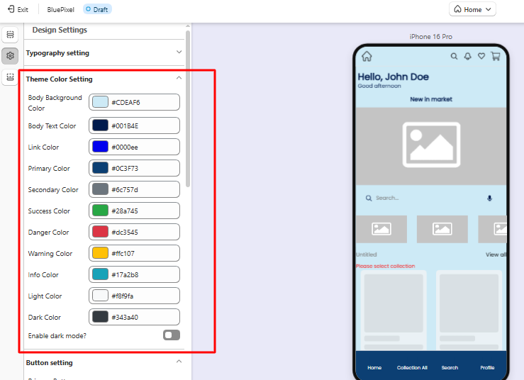
### Theme Color Settings
The **Theme Color Settings** allow you to define the main colors used throughout the mobile app interface. These colors ensure consistent branding and improve visual appeal.
#### Body Background Color
Defines the background color used across most app screens.
Example: #CDEAF6
#### Body Text Color
Controls the default text color used for general content.
Example: #001B4E
#### Link Color
Defines the color used for clickable links inside the app.
Example: #0000EE
#### Primary Color
The **primary color** represents the main brand color of the app and is commonly used for:
* Primary buttons
* Highlights
* Important UI elements
Example: #0C3F73
#### Secondary Color
Used as a supporting color for UI components and less prominent actions.
Example: #6C757D
#### Success Color
Indicates successful actions such as:
* Order completion
* Successful form submission
Example: #28A745
#### Danger Color
Used for warnings, errors, or destructive actions.
Example: #DC3545
#### Warning Color
Used to show caution messages or alerts.
Example: #FFC107
#### Info Color
Used for informational messages or notices.
Example: #F8F9FA
#### Light Color
Used for light UI backgrounds and subtle elements.
Example: #17A2B8
#### Dark Color
Used for dark elements such as headers or strong UI contrast.
Example: #343A40
#### Enable Dark Mode
When enabled, the app will support **Dark Mode**, allowing users to view the interface with darker colors, which can reduce eye strain and improve readability in low-light environments.
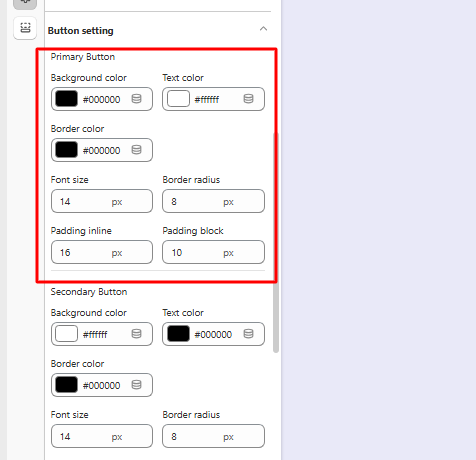
## Button Settings
Button settings allow you to customize the appearance of buttons used across the mobile app.
There are two types of buttons available:
1. **Primary Button**
2. **Secondary Button**
#### 1. Primary Button
Primary buttons represent the **main action** a user should take on a screen (e.g., Add to Cart, Checkout).
#### Available Settings
**Background Color**\
Defines the background color of the button.
Example: #000000
**Text Color**\
Defines the color of the button label text.
Example: #ffffff
**Border Color**\
Defines the border color of the button.
Example: #000000
**Font Size**\
Controls the text size inside the button.
Example: 14
**Border Radius**\
Controls how rounded the button corners appear.
Example: 8
**Padding Inline**\
Defines the horizontal spacing inside the button.
Example: 16
**Padding Block**\
Defines the vertical spacing inside the button.
Example: 10
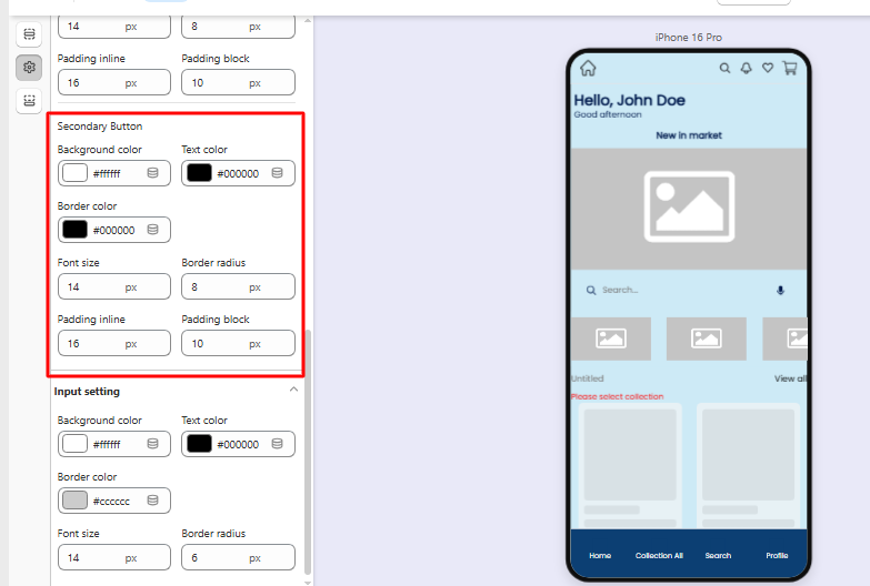
#### 2. Secondary Button
Secondary buttons represent **less important or alternative actions**.
#### Available Settings
**Background Color**\
Defines the background color.
Example: #000000
**Text Color**\
Defines the text color.
Example: #ffffff
**Border Color**\
Defines the button border color.
Example: #000000
**Font Size**\
Controls the button text size.
Example: 14
**Border Radius**\
Defines the roundness of button corners.
Example: 8
**Padding Inline**\
Defines horizontal spacing inside the button.
Example: 16
**Padding Block**\
Defines vertical spacing inside the button.
Example: 10
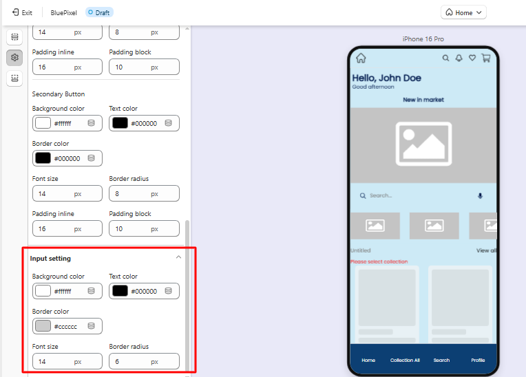
## Input Field Settings
The **Input Settings** allow you to customize the design of form fields used throughout the mobile app, such as:
* Login fields
* Search bars
* Address fields
* Checkout forms
#### Available Settings
**Background Color**\
Defines the background color of the input field.
Example: #ffffff
**Text Color**\
Defines the color of the text entered by users.
Example: #000000
**Border Color**\
Defines the border color around input fields.
Example: #cccccc
**Font Size**\
Controls the size of text inside the input field.
Example: 14
**Border Radius**\
Controls how rounded the input field corners appear.
Example: 6
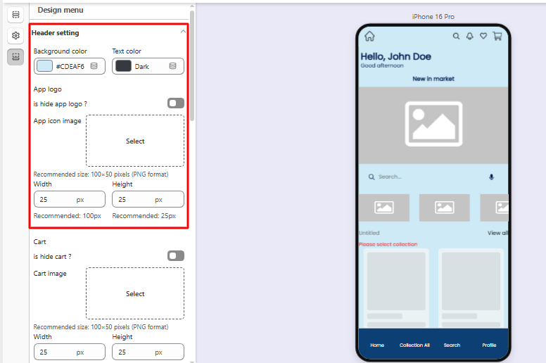
## 6. Design Menu Settings
The **Design Menu Settings** allow you to customize the appearance and elements of the app’s **Header** and **Bottom Navigation Menu**. These settings help you control the layout, icons, colors, and visibility of important navigation features in your mobile app.
## Header Settings
The **Header** is the top section of the app where important navigation elements such as the logo, search, cart, and notifications appear.
#### Header Colors
**Background Color**\
Defines the background color of the header area.
Example: #CDEAF
**Text Color**\
Controls the color of text elements displayed in the header.
### App Logo
Controls how the store logo appears in the header.
**Hide App Logo**\
Option to hide or display the app logo.
**App Icon Image**\
Upload your store logo.
Recommended format: **PNG**\
Recommended size: **100 × 50 px**
**Width / Height**\
Allows you to adjust the display size of the logo within the header.
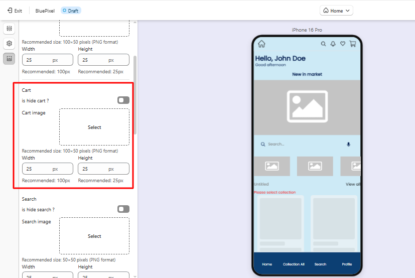
### Cart Icon
Controls the shopping cart icon displayed in the header.
**Hide Cart**\
Option to hide or display the cart icon.
**Cart Image**\
Upload a custom cart icon.
Recommended format: **PNG**\
Recommended size: **100 × 50 px**
**Width / Height**\
Controls the display size of the cart icon.
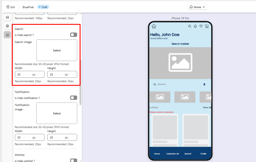
### Search Icon
Controls the search feature in the header.
**Hide Search**\
Option to hide or display the search icon.
**Search Image**\
Upload a custom search icon.
Recommended format: **PNG**\
Recommended size: **50 × 50 px**
**Width / Height**\
Adjust the icon display size.
### Notification Icon
Controls the notification icon used for app alerts and updates.
**Hide Notification**\
Option to hide or display the notification icon.
**Notification Image**\
Upload a custom notification icon.
Recommended format: **PNG**\
Recommended size: **50 × 50 px**
**Width / Height**\
Adjust the icon display size.
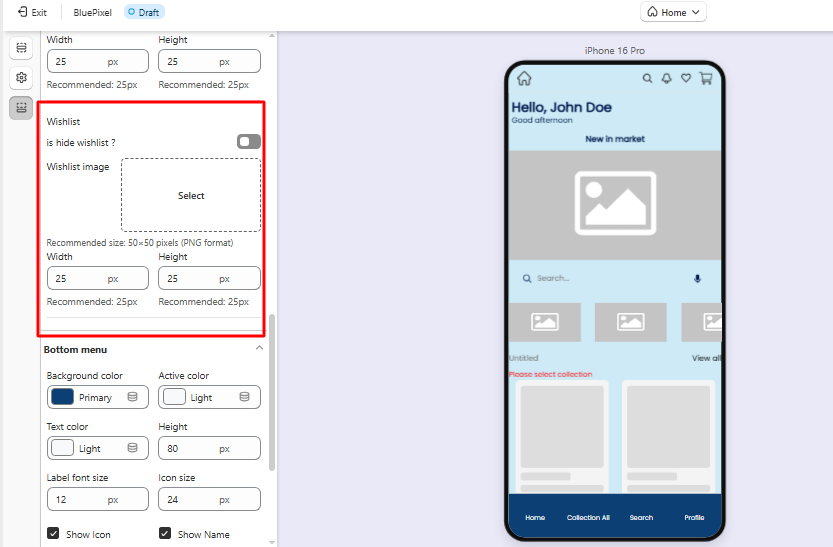
### Wishlist Icon
Controls the wishlist icon shown in the header.
**Hide Wishlist**\
Option to hide or display the wishlist icon.
**Wishlist Image**\
Upload a custom wishlist icon.
Recommended format: **PNG**\
Recommended size: **50 × 50 px**
**Width / Height**\
Adjust the icon display size.
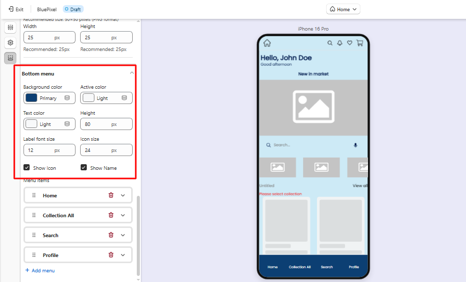
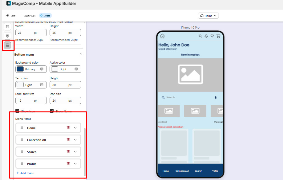
## Bottom Menu Settings
The **Bottom Menu** is the navigation bar displayed at the bottom of the app, allowing customers to quickly access important sections.
#### Menu Appearance
**Background Color**\
Defines the background color of the bottom menu.
**Active Color**\
Defines the color of the active or selected menu item.
**Text Color**\
Controls the color of menu labels.
**Height**\
Defines the height of the bottom navigation bar.
**Label Font Size**\
Controls the text size of menu labels.
**Icon Size**\
Defines the size of icons displayed in the menu.
### Menu Display Options
**Show Icon**\
Displays icons for each menu item.
**Show Name**\
Displays labels below icons.
### Menu Items
Merchants can configure which sections appear in the bottom navigation menu.
Common examples include:
* **Home**
* **All Collections**
* **Search**
* **Profile**
* **Cart**
* **Wishlist**
You can customize these menu items based on the navigation structure you want to provide to your customers.